Novon
Pharmaceutical Infrastructure
Challenge
As a key players in the German pharmaceutical infrastructure and real estate sectors. Their business involves owning and operating pharma parks. Infrareal originally a subsidiary of Pharaserv needed its own identity that closer aligned with its forward looking direction. as a part of the rebrand we proposed a new name Novon.
Approach
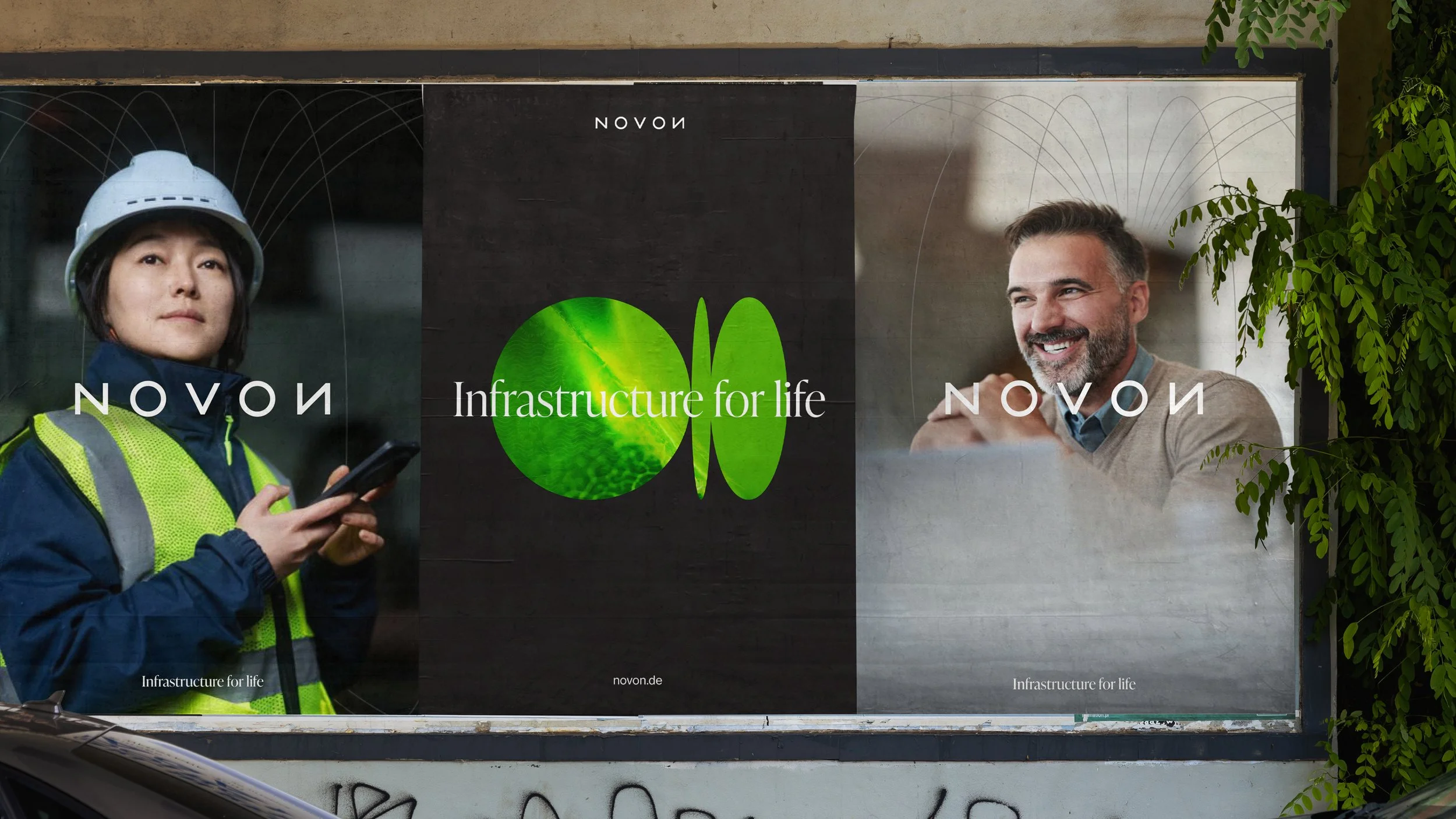
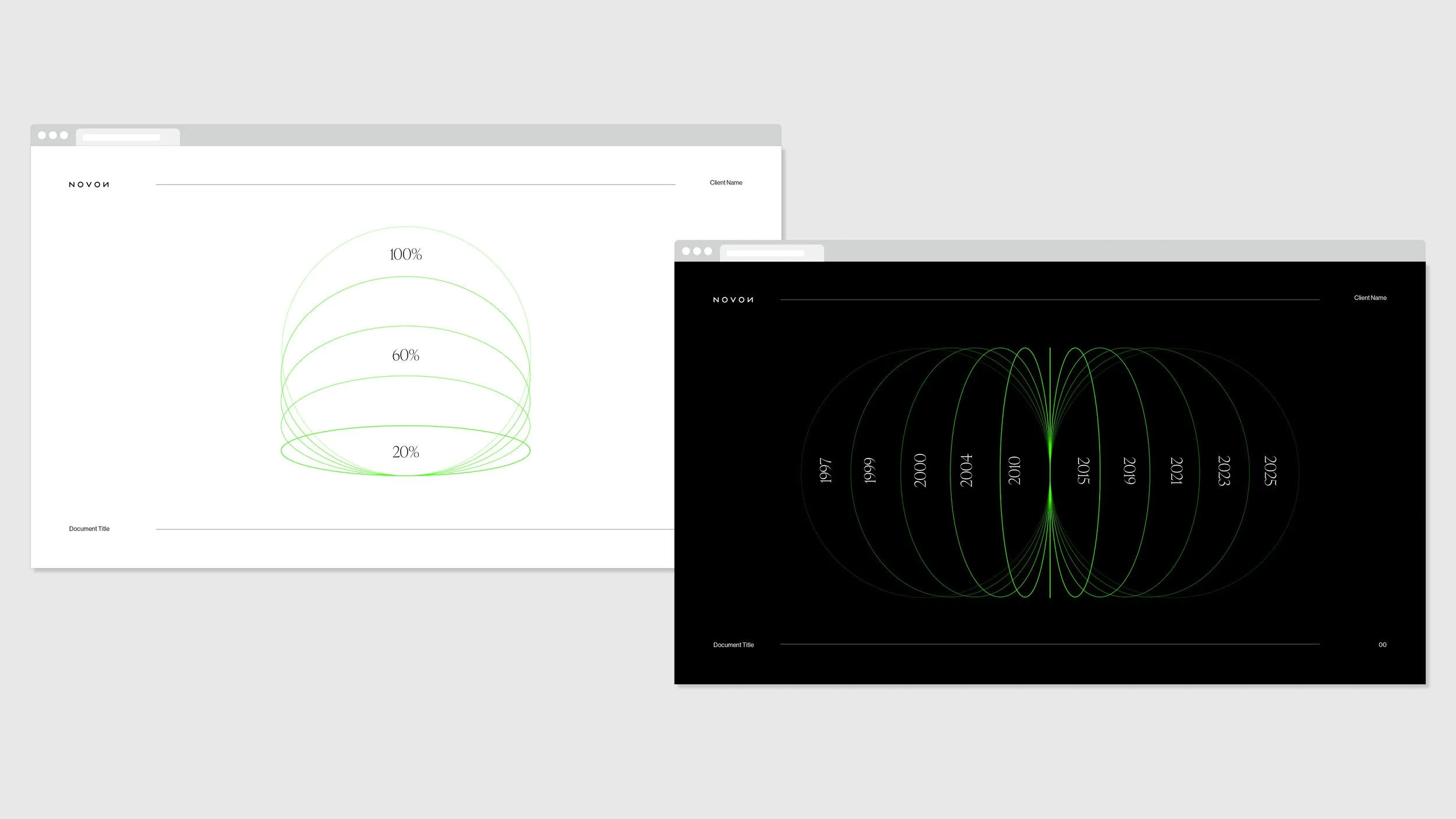
The rebrand needed to be future focused and timeless capturing the trusted working partnership that Novon has with its clients. It also had to feel human and vibrant and expressive to align with the strap-line “Infrastructure for life’ The name Novon: Absolute symmetry of this geometric palindrome gives it a powerful graphic quality. The name and logo are perfectly balanced with the key ‘O’, ‘V’, ‘O’ characters. Additionally, derived from the Latin ‘new’, we think this name has great relevance for the business in looking toward the future for both external and internal audiences, signalling the company’s growth and change. The Device: A circular central theme runs through the concept. The single cell, the petri dish, the egg are all themes of genesis and beginning of life.


