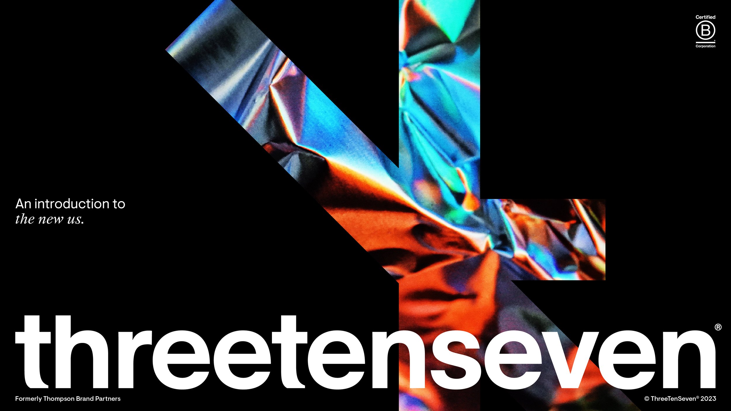
ThreeTenSeven
Design agency internal rebrand
Challenge
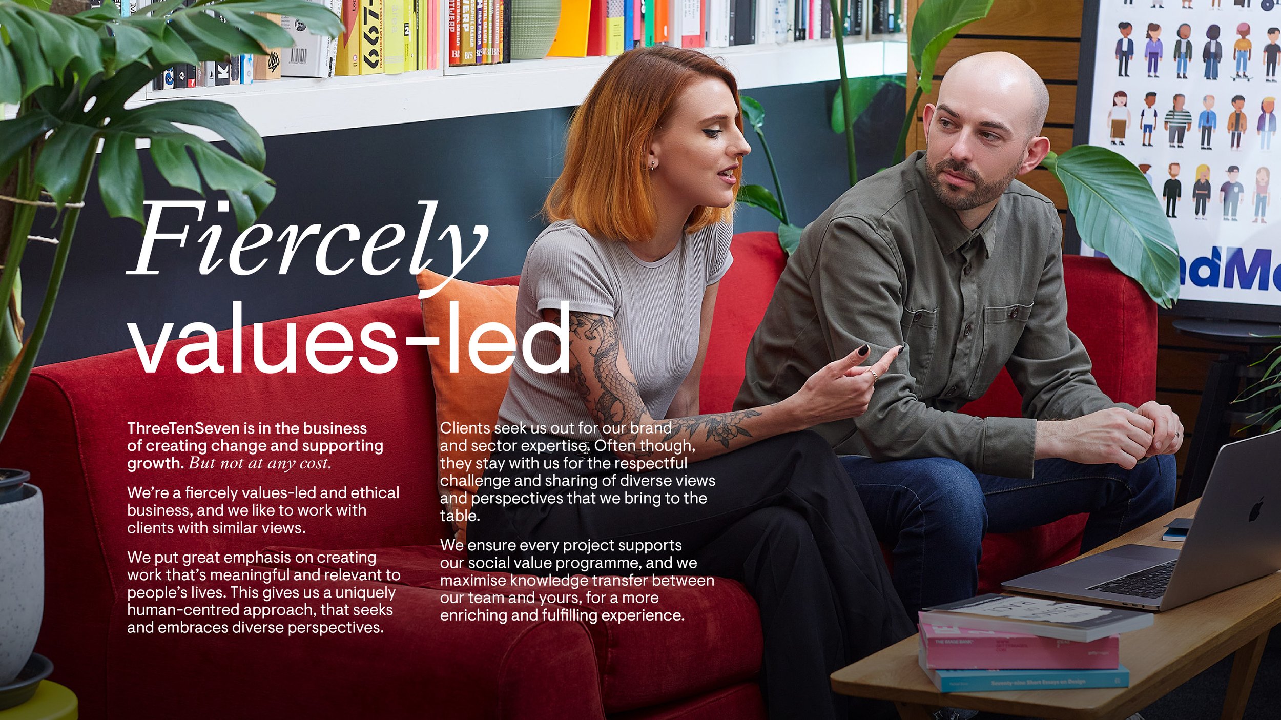
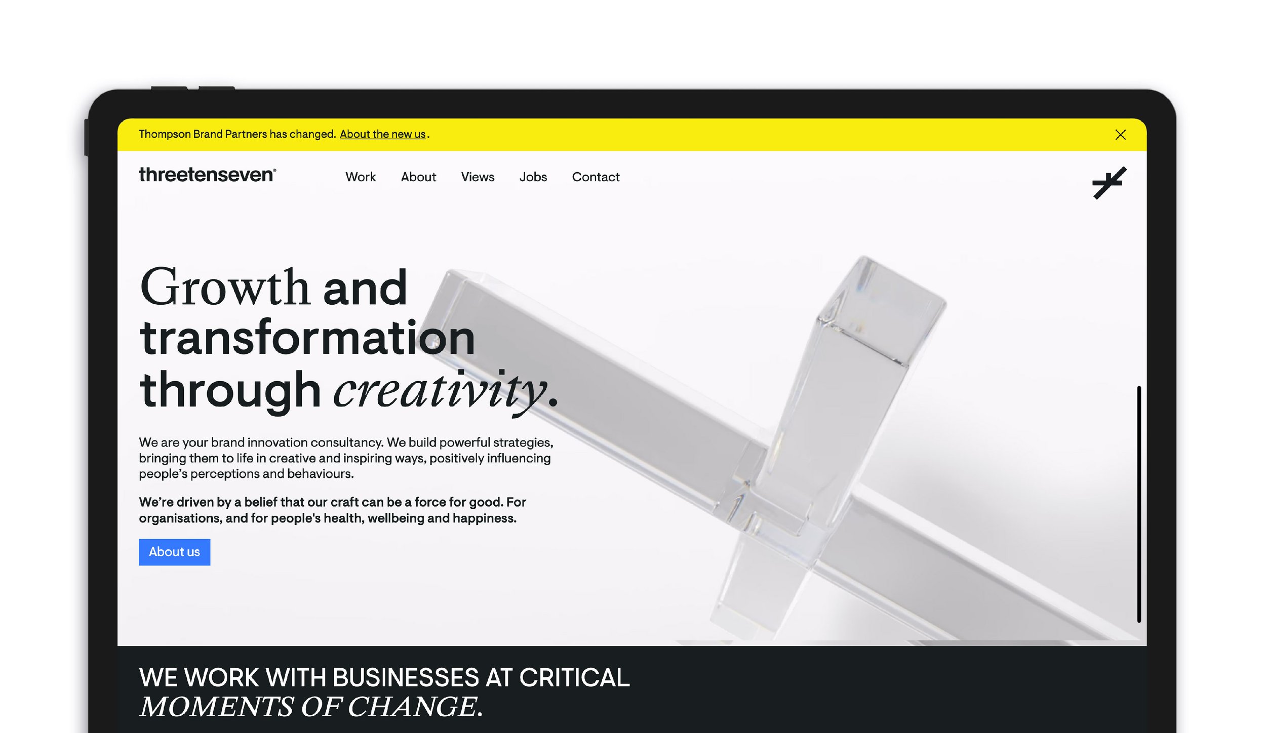
To rebrand the agency I was working for. ThreeTenSeven, formerly known as Thompson Brand Partners, decided to rebrand after 12 years. Thompson, an award winning design studio ThreeTenSeven wanted to re-position themselves to be leading strategic consultants who transform organisations within the health and wellbeing sector.
Approach
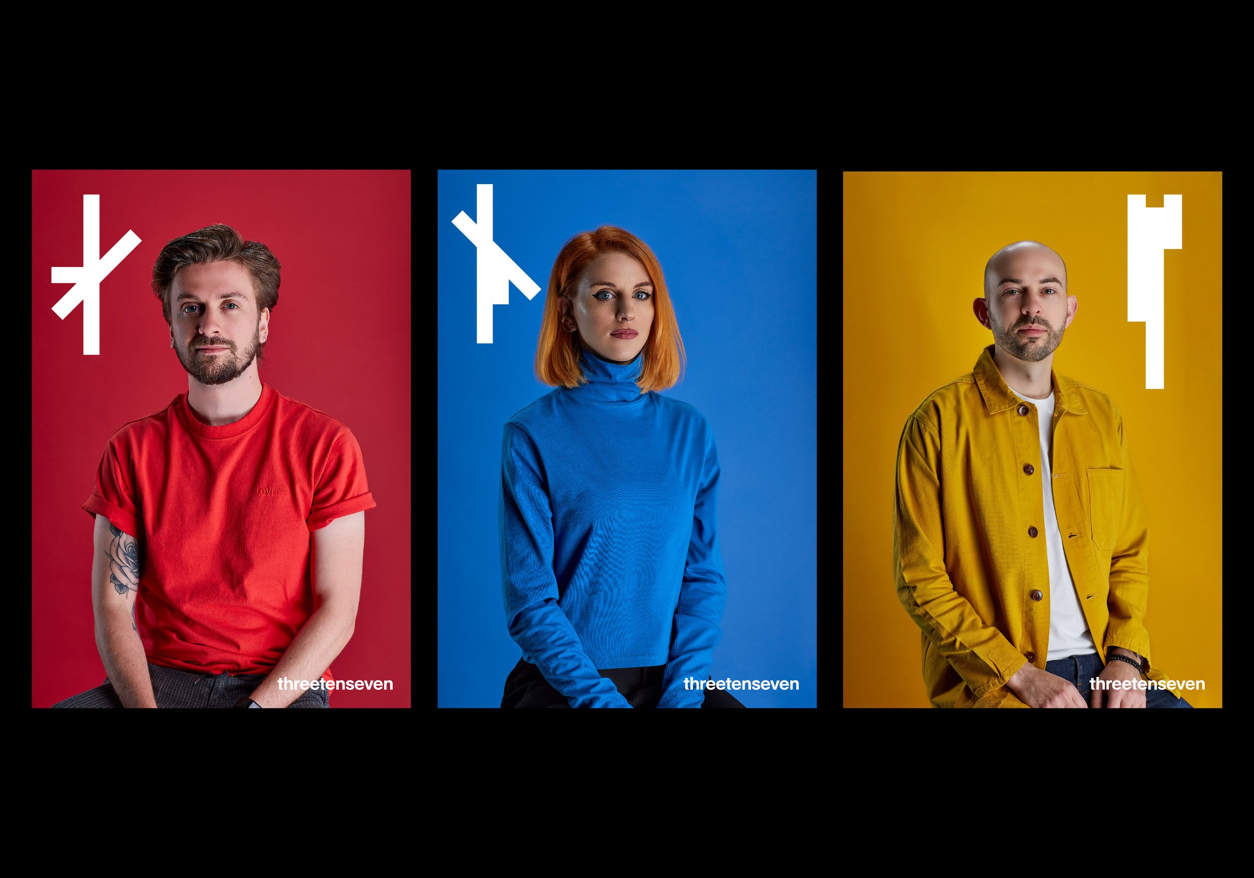
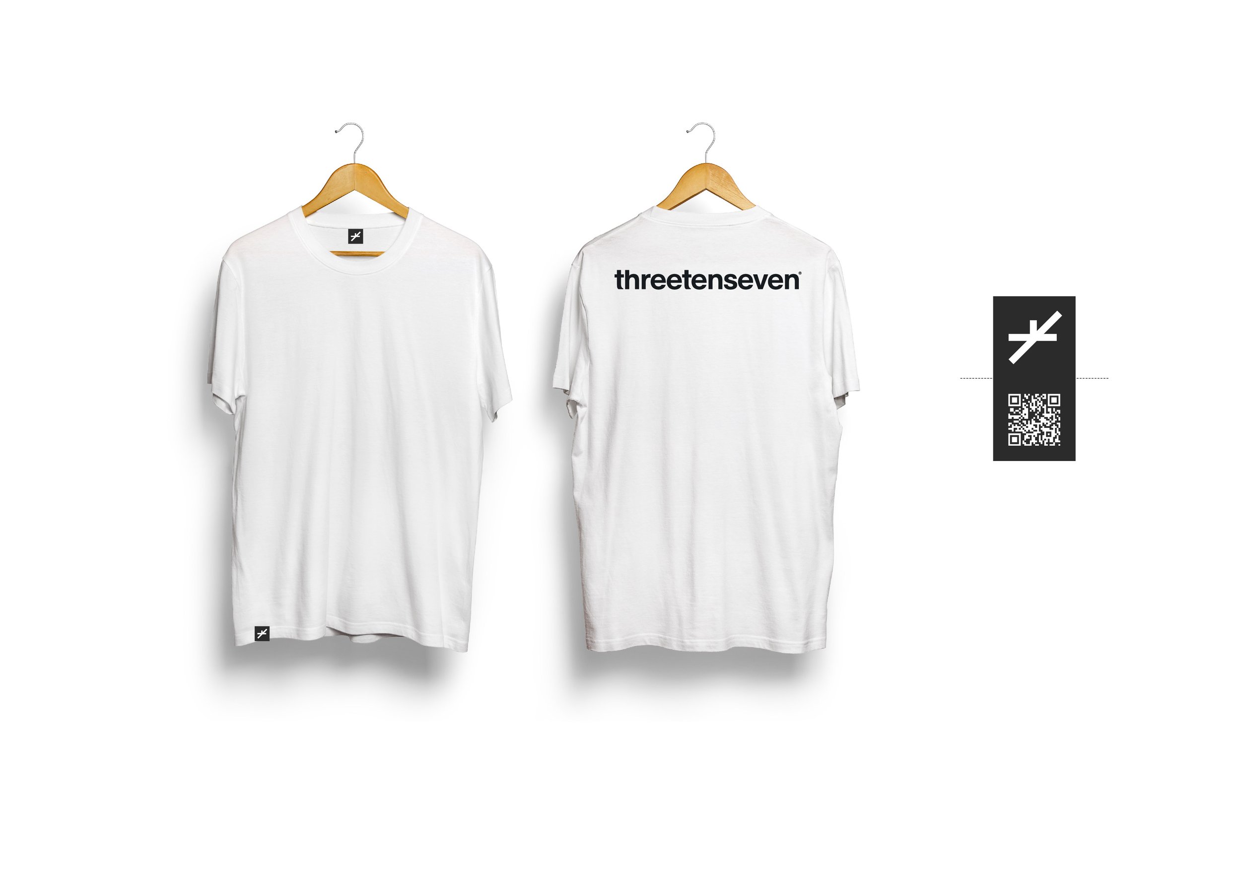
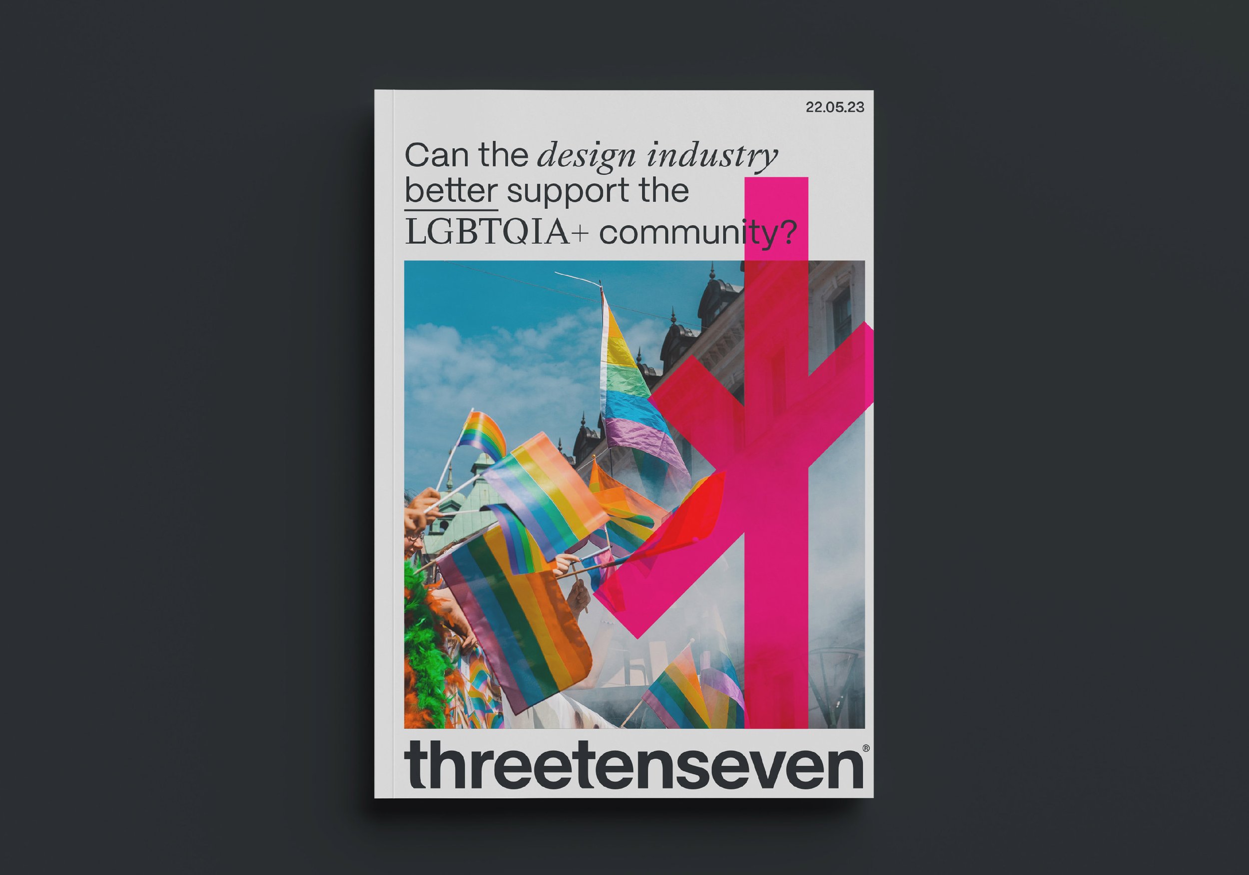
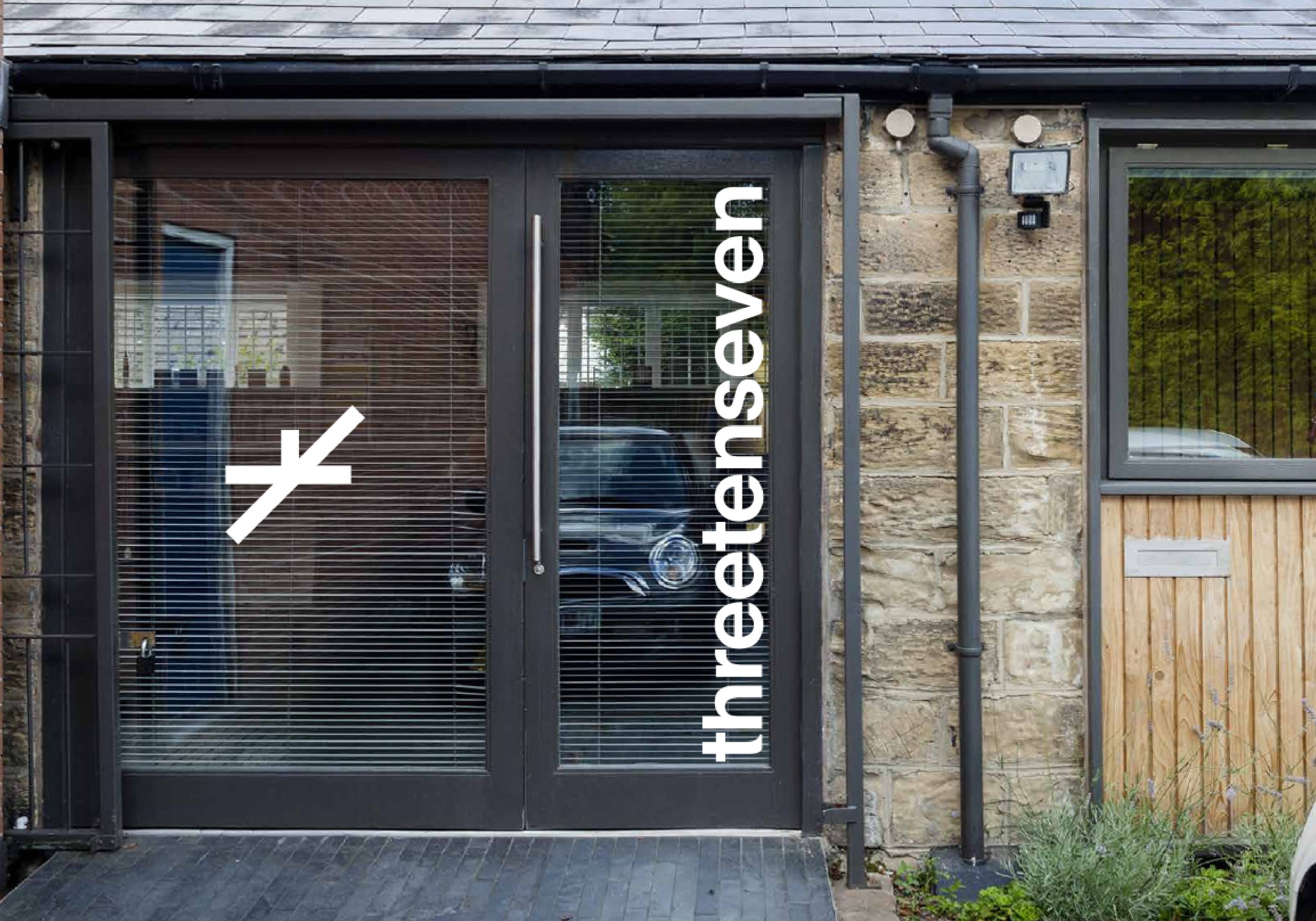
We had three days to put together the new visual identity for the agency. The graphic device is made up of 3 fixed line lengths with a ratio of 3:10:7. I created a set of these dynamic shapes that represent intersectionality and the coming together of people and ideas.
Result
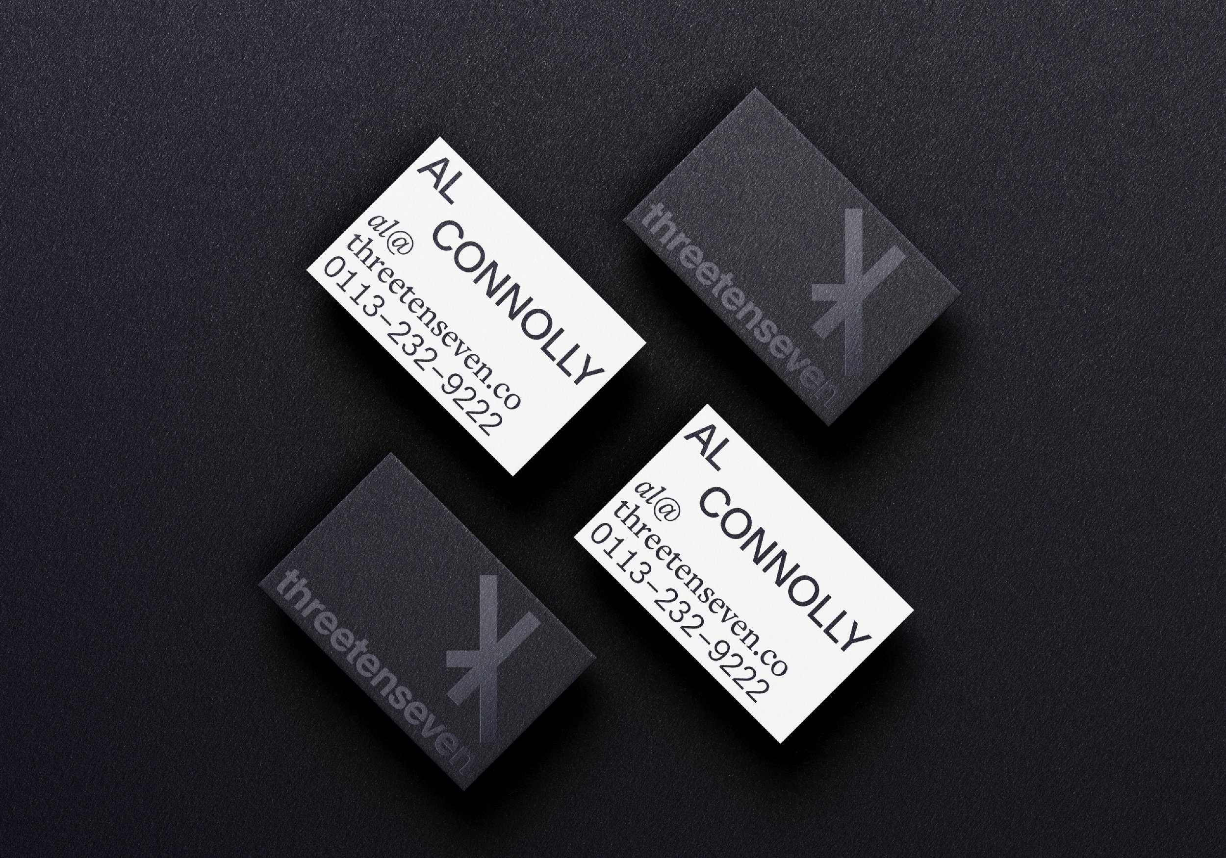
A new identity that better reflects the ethos and direction of the agency.
